Wednesday, 31 October 2012

Model 3: Space Tank Part 1 of 3

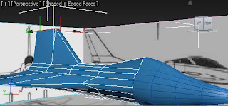
          Based from the tutorial from my previous model, I carry on the techniques I have learned like deleting half of the model and then copying the other half using Mirror with Reference option.

          I found this photo and became my base model.

Figure 1. My base Model (Pheylan, 2008)
 
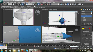
          While doing the body of my space tank, I realised that I need more edge near the front of my tank in order for me to get the shape that I need. After deleting the half of the rectangle, I used QuickSlice to add another edges (Figure 2).

Figure 2. QuickSlice
  
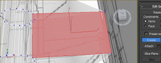
          Shaping the body of the tank is challenging because you should be very keen of what vertex, edge or polygon to use in order to get the shape of the body. One of the things I did here was to connect the vertex that is near to another vertex (Figure 3). With this, two or more vertices will became one and it is easier to manipulate the shape.

Figure 3. Weld Vertices

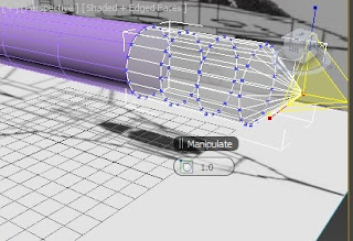
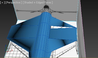
           I added an engine underneath the tank. Though my engine looks like a cupcake tray commented by my classmate, I am happy of what I have done. In this, I used box, cylinder, and tube with Bevel effect (Figure 4). I added the colour red because most of the engine I searched is coloured with red and it is also act as the "heat" coming out from the engine so might as well used it.

I
Figure 4. The engine underneath my space tank


References:

Pheylan, 2008. SciFi-Vespasian Light Grav Tank. [online] Available at: <http://www.foundation3d.com/forums/showthread.php?t=3186> [Accessed 30 October 2012]

Tuesday, 30 October 2012

Model 2: Spaceship 2

          A little bird told me that why not try searching for a tutorial in making a spaceship because I'm stuck again for my next model. So, I decided to do his suggestion. I searched for a video in Youtube and landed on this tutorial (Eugene Ch'ng, 2012).

          By watching the tutorial, I discovered a lot of techniques. The first step is to have a sphere and delete the other half (Figure 1). Just a reminder, the segment of the sphere should be "even" number so that you could divide it by two. To divide it, you can place your sphere in Y axis (pattern the edges as seen in Figure 1, upper-left corner image). This method will make it easier for you to select all the vertices and delete it.
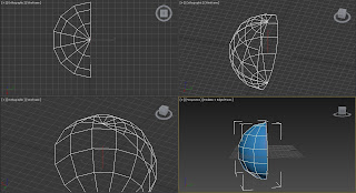
Figure 1. Deleting half of the sphere


           The reason why I deleted half of the sphere is because I will duplicate it with the Mirror tool with Reference option. Why I did not used Copy option? The difference between these two is, Copy option is just copying the element. On the other hand, Reference option is copying the element and if you do some modification on that element, the copied element will modify itself too. So it saves time and make you element sides even. After that, I manipulate some vertices to add shape on my spaceship and added Bevel effect to give details on it (Figure 2).
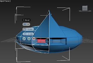
Figure 2. Mirror tool with Reference option and Bevel option


          In order to avoid the curve bottom, I selected the center vertex and all the vertices around the it and then move it upward to achieve a flat bottom look (Figure 3). You can also see that I added wings by using the Extrude option in the polygons.
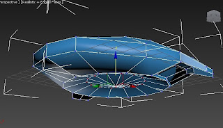
Figure 3. Moving the vertices to add flat bottom look

           Another technique I discovered are the Detach and Attach options. I added windows to my spaceship by selecting three polygons next to the polygons near the center vertex and then chose Detach options (Figure 4). With this method, these polygons are now new element. To give a window effect, I added colour on it and duplicated as shown in Figure 5. 
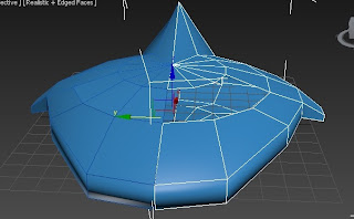
Figure 4.

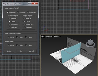
           I accidentally moved the other half of the spaceship. With the Align tool, problem is solved (Figure 5). After aligning it properly, I combine these elements by using Attach option and Weld all the vertices in the middle to unite the vertices since they are in the middle.
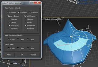
Figure 5. Align Tool

           I changed the colour of the spaceship just like from my first model to give it "like a spaceship effect" and the fact that this colour is common to it.
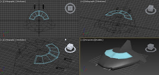
Figure6. Spaceship 2

Total Polys: 446
Total Verts: 385


          A very simple spaceship with few polygons. I guess, with this amount of polygons, this is very good for gaming especially those simple games as well as for Media students. But, I also think that for us, Media students, we should have more details to make this look more attractive to others.

References:

Eugene Ch'ng, 2012. 3D Studio Max Tutorials -Creating a Spaceship. [online] Available at: <http://www.youtube.com/watch?v=txUWtVUSitg> [Accessed 30 October 2012]

Monday, 22 October 2012

Material Editor

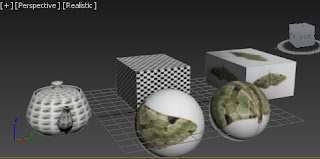
          I first used the Material Editor from the Aircraft exercise so I don't find it that hard. Figure 1 shows how the images behave according to the different options found in the Material Editor. I used a 2D bitmap images that fitted well on a 3D object.

Figure 1. Applying bitmap images

          Thus, this is helpful on designing your model as well as like a guide just like what I did from the aircraft exercise.

Sunday, 21 October 2012

Model 1: Spaceship Part 2 of 2

          From my previous post, I already made wings for my spaceship. I find my spaceship "fat", so I decided to reduce the width of the body element by moving the vertices as shown in Figure 1.

Figure 1. Moving the vertices to shape the body of the spaceship

          As you can see in Figure 2, I added an element in the middle of the body. I was able to get that shape not by extruding but by moving the vertices then added a cylinder. This element will be the window as most of the usual spaceship has.

Figure 2. Shaped by elements by moving the vertices

          I tried the Extrude first in adding some details on the engines but it did not look well. With this kind of design, Bevel is much better as shown in Figure 3.

Figure 3. Added details on the engines

          I also tried to add some details on my spaceship's wings. In this process, I used the Boolean method in deleting the unwanted shape (Figure 4). It is like a scissor cutting a paper to form a shape. Of course, I made used of different element to get the shape that I want.

Figure 4. Boolean option

          After that, I coloured it red the same in my base model. I also changed the colour of my spaceship to make it looks like a spaceship because that is the colour of the most spaceships that I found.

Figure 5. Spaceship

Total Polys: 2, 132
Total Verts: 1, 922

          The number of polygons here are not too much so it is also good for gaming.

Saturday, 20 October 2012

Model 1: Spaceship Part 1 of 2

          It took me a long time to decide what should I do, not until the aircraft tutorial. I decided to start the same way as the tutorial and found a base model (Figure 1).

Figure 1 My base model (Octopus41092)


          The body of my model is from a cylinder shape while the pointed red tip (refer to Figure 1) is from a cone. These elements undergone to a process of rotating and moving as well as aligning. One thing to remember here is to make the important parameters the same as the other such as the Radius and Sides to avoid the mistakes I had before in one of the exercises (compare Figure 3 and 4).

Figure 2. Rotating, moving and aligning the elements

Figure 3. Cone parametersFigure 4. Cylinder parameters
       
          In order for me to get the shape that I need, I used the Scale tool by selecting all the front vertices (Figure 5) and shaped them until it has a small width from the pointed shape (coloured in violet).

Figure 5. Move vertices


          Here, I did not Extrude the wings rather I added a box. Some of the parts of the spaceship's wing are in curve shape. I was able to achieve a curve shape by using the Connect option to add vertices and manipulate it to have a curve side (Figure 6). Another method I thought after doing this is the Boolean tool, maybe it will be much easier and save time instead of what I have done.

Figure 6. Connect option to add vertices for curve shape

          After getting the curve, to save time, I duplicate this element by Mirror tool with Copy option (Figure 7).

Figure 7. Mirror tool

References:

Octopus41092. 3D Model of Spaceship. [online] Available at: <http://www.exchange3d.com/3D%20Model%20of%20Spaceship/prod_5201.html> [Accessed 19 October 2012]

Monday, 15 October 2012

Small Derelict Village Exercise

          Airsofting is what I was thinking when I made this exercise. I added two boxes, a cylinder and a tube to start with. I find my box small for my design so I extrude it (Figure 1). Maybe you will ask me why I did not change the length of this object, it is because I already converted it to Editable Poly. Or use scale, it is I find extrude easier than using the Scale tool. 

Figure 1. Extrude the box to make it longer

          After that, I used Boolean option to make a hole to my box so that it will look like a building (Figure 2). I also added stairs which can be found in Stairs option to add more detail to my building (Figure3).

Figure 2. Boolean modifier

          To show a ruined building, I manipulate the vertices of my object to add some kind of a dent effect to the wall (Figure 3).

Figure 3. Ruined building
         
          This might not look really good but at first I really want my design with a messy look. So that the feeling of my village is like there is a war going on (Figure 4).


Figure 4. Village view 1

          I also added a barrel look design for my cylinder (Figure 5). Because I sometime see barrels on a place for airsofting. Most probably even just a small objects just for people to hide is okay for this kind of design.

Figure 5. Village view 2

          It would have mean nicer if I put small boxes to add bricks effect and little holes from the wall to add "damage" effect on the building.

Aircraft Exercise

        In this exercises, I learned about using place to add and image and make it like a guide for my aircraft using Material editor. Figure 1 shows my workspace when I added tha objects and aligning them properly using the Align tool. These plane shapes will be my base image model for my aircraft. With this method, it is easier for me to manipulate the shapes accroding to the images.

Figure 1. Image added to the plane shape

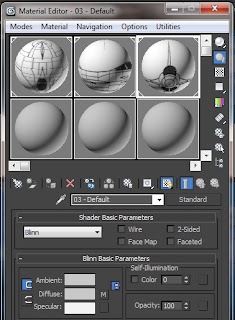
          These images were added using the Material Editor (Figure 2). This tool is useful in adding images to a 3D shape.

Figure 2. Material Editor

          To start with my aircraft, I added two cylinder then Scale down all the vertices in front then combine all of them with Weld option (Figure 3). This will be the "nose" of my aircraft.

Figure 3. Scale and Weld

          I encountered a problem with these cylinders. Because they are separated cylinders, I found out that there are still gaps between my long and small cylinder. What I did was I positioned the vertices according to the vertices of the other cylinder (Figure 4). With this method, I was able to solved my problem.

Figure 4. Vertices in the right position

          I'm not sure what happened (maybe I accidentally do it) but one polygon on my wings is gone (Figure 5). I panicked when I saw this. But I managed to find a solution by creating new polygon by Create option under Polygon modifier (Figure 6).

Figure 5. Missing polygon

Figure 6. Create a polygon

          So far, Figure 7 shows my aircrft model.

Figure 7. Aircraft

Sunday, 14 October 2012

Castle Exercise

          For my castle model, I used Boolean tool to make a hole in the box (Figure 1). This will add an effect that the four walls will be the boundaries of my castle. In addition to that, the pink box is taller than the green box, it is because I want to make a "hole". If your "cutter" object is smaller than the object to be cut, there is a possibility that some polygons will still be there.

Figure 1. Boolean option

          Duplicating an object is helpful if you want to add an object with the same size like what I did in Figure 2.


Figure 2. Mirror tool

Alignment Exercise

         In this exercise, I learned how you can easily manipulate the alignment of the different objects using the Align Tool . I encountered some problems while doing this exercise not with the alignment tool but with the object itself. As you can see in Figure 1, the two objects are not the same. Although I resize the cone to overcome this problem, still, they are uneven. This is because the number of sides are not the same. Even if they have the same size such as the radius, if the number of sides are not the same, they will not "fit perfectly". So, I just created new objects with same size and sides. 

Figure 1. Uneven

          Align tool works for X, Y, Z axis. Honestly, it is a matter of trial and error if you're using this tool like what I did (Figure 2). And also, it takes one position at a time.

Figure 2. Align tool

          Remember my problem I had earlier? After making new objects, the result is better. Having the same size and number of sides, the two objects fit perfectly.

Figure 3. The same number of sides

          Figure 4 shows the output of this excercise which is aligning the objects.

Figure 4. Aligned objects

House Exercise

          Before, I always have this in mind that I could not make a house. But I was wrong! Everything start from simple things. I started my house with just a box and used Connect tool to add edges. These edges will be my guide to add a door and windows. Furthermore, as simple as extruding a polygon, I was able to make my door (Figure 1).

Figure 1. Connect and Extrude options

          I thought, everything is okay until I saw the odd looking roof on the left hand side of the roof (Figure 1 - uppper-left image). This gave me a hint that there is something wrong with my vertices. Therefore, I moved the vertices to balance it with the other side. In making the chimney, at first I thought of using the Boolean tool but I ended up using the Extrude tool with negative value (Figure 1). It was okay and it saved my time. If I used the Boolean tool, I still need  to make another object as a guide. But with the Extrude tool, I just change its value. Maybe in some cases like this, it is fine to use it. So it is still depends on what you wanted to do.

Figure 2. Odd looking roof and chimney

          In addition to my problem, I found out that there are unwanted edges on the wall as shown in Figure 3. This is, maybe, because I moved some vertices and the result of so many trial and error process using the Connect tool. I managed to make my wall neat by removing the edges.

Figure 3. Unwanted edges

          This is my house (Figure 4), the house that I thought I couldn't make.

Figure 4. House

Saturday, 13 October 2012

Polygon House (Again)

          Due to my clumsiness, I lost my work and need to redo all the tutorials again. On the brighter side, doing it all over again made me and the software became friends. In the sense that I worked better than what I used to be.

          I haven't finished the whole tutorial but I improved a lot from the first. Here is the outcome of my second try (Figure 1).

Figure 1. Poly House


Tuesday, 2 October 2012

Polygon House

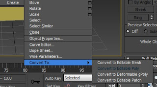
          I really had a hard time doing this because this was my first time using the Autodesk 3D Max software. The first thing to keep in mind is that the object should be converted into Editable Poly (Figure 1) so that you could use the options under Modify Tab.

Figure 1. Converting the object to Editable Poly

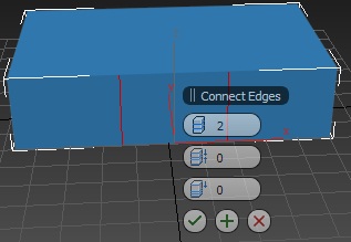
          What I have learned on this tutorial is how to use the Connect Edges (Figure 2). At first, I was a bit lost in finding this tool. This tool is like adding another polygon from an object.

Figure 2. Connect option
      
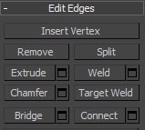
          From the tutorial, I used the Connect and Extrude options a lot and was able to understand these two options.

Figure 3. Edges options
     
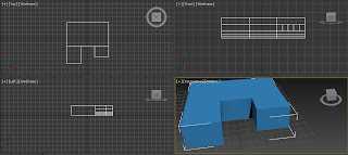
           This is my polygon house for now.

Figure 4. My poly house