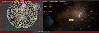
Sunday, 9 December 2012

Space War - My final animation

          I uploaded my final animation on youtube and you can watch it here.


          I must say that I'm far away from what I used to be in terms of using this software. This software is new to me and at first I was thinking that it will be so hard because I couldn't even make a house. But as time goes by, I enjoy working on it.

          Enjoy! ^___^

Saturday, 8 December 2012

Animation: Combining all the scenes in Adobe Premiere

          After finishing all the scenes, I combined all of them in Adobe Premiere as shown in Figure 1. I added two audio taken from youtube (please refer to References) and it fits my animation. It wasn't as fabulous as Star wars though but the sound itself gave something to my animation. It became alive!

Figure 1. My animation workspace in Adobe Premiere


          And on the credits part, I used the Star Wars theme song so that people will know that they have just watched a Star Wars inspired animation. Because I doubt that others might not know the first audio because it is not as popular as the second.

References:

lfe011969, 2010. Star Wars Custom Movie Intro - Death Star Exploding (Final with sound!) . [online] Available at: <https://www.youtube.com/watch?v=c9j65ju8Rag> [Accessed 5 December 2012 ]

Ben57599, 2011. Star Wars Blaster Sound Effect . [online] Available at: <https://www.youtube.com/watch?v=wjBevX4NKgk> [Accessed 5 December 2012 ]

Animation: Bomb and Fire Effect

          I'm almost there! One of the scenes in my animations is where the spacetank will explode using its own rockets. How? Spaceship 1 will be followed by the spacetank's rockets. As it approaches the spaceship 1, the spaceship 1 will go underneath the spacetank and the rockets will go straight to it. Boom! The spacetank will explode. This is the scenario that I want to make.

          Honestly, I had a hard time finding a good tutorial. I even found something with coding and so much to do in 3ds max where I think that I need more time to learn it. I didn't stop until I get a simple tutorial. And this tutorial (c123hris, 2012) is all about the bomb (please refer to Figure 1, the white pyramid shape on the left-hand side) under Space Warps > Geometric/Deformable. In addition to that, I'm so confused why I can't get it right and I'm following the tutorial. When I tried it, all the parts are gone. In programming terms, I debugged to see where the problem is coming. I even made a sample workspace. Then again, I didn't stop and I couldn't even sleep because I was thinking that "I'm almost there".

          I found out that it was actually doing the effect, it is just that it always starts in frame 0 and I'm already in frame 540 which means that all the parts are already scattered. So, I tried to look for something that it says where to start. I tried every selection and found the guilty one. It is the  Detonation field. From the sample workspace I made, I was able to set what frame should the bomb explode and apply it on my animation as shown in Figure 1. I even posted a message on youtube tutorial asking the one who made the tutorial about my problem but deleted it after finding the solution because I found it out like 20 minutes after I posted it.
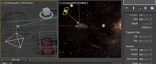
Figure 1. Bomb
 
          Moreover, I saw that it wasn't realistic because the rockets didn't explode which should epxlode when it hit the spacetank. So, I bind (Figure 2) the bomd to the rockets so that both the spacetank and the rocket will explode at the same time.

Figure 2. Binding the bomb to the rockets

          Furthermore, to make it more realistic, if there is an explosion there should be a fire. I added a fire and smoke effect in my animation. The fire can be done in Helpers > Atmospheric apparatus > SphereGizmo.In here you can add a fire effect and by just manipulating the settings, you can achieve a good fire explosion effect (Figure 3). Besides that, you can even set the time of how long the explosion and how big it is. Again, I'm super happy of the outcome. All my hard work of searching and patience paid off.
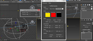
Figure 3. Fire effect

          To end my animation, by showing my two spaceships, it denotes that they have won the battle. On Figure 4, it shows that to make an effect that it is moving far from the camera, I scale down its size. The reason why I scaled it down is because my galaxy sphere is not big enough for my spaceship any farther so I just used this technique.

Figure 4. Scaling down the spaceship 1

          Oh yes, I'm so proud of myself that's why I put my name in my animation as shown on Figure 5. It also shows how it suits the glow effect on spaceship's engine. It's a bit too bright though.
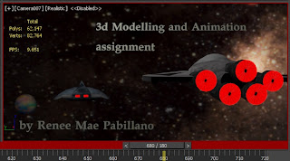
Figure 5. Credits

References:

c123hris, 2012. [With Voice Narration] 3ds Max Explosion Tutorial (without plugin) . [online] Available at: <http://www.youtube.com/watch?v=CVqKN9VQ3gg&feature=youtu.be> [Accessed 6 December 2012 ].

Friday, 7 December 2012

Animation: Laser and Engine Effect

          Figure 1 shows my 2nd camera view. As you can sill recall, I finished my 10 second animation showing my spacetank at far. This time, I focus on that model. I used this type of view to show how my spacetank model see the two spaceship flying far from him. As you have noticed, I changed earth to a colourful planet. The reason? Because I felt that I don't want the earth to be in the middle of the space war. I feel like the earth is in trouble!

Figure 1. Spacetank view

          I used a cylinder shape to make a laser effect (Figure 2). This might be weird because of the structure of my model and then I'm using a laser. Anyway, somehow, I like the laser because it is appealing to the eyes. And the fact that from the Star wars movie, they have loads of lasers including their weapon. So, I guess, this will make my animation much better.

Figure 2. A cylinder shape to make a laser

          I found a tutorial in youtube (Kirk, 2011) and followed the steps on how to make a laser and I was successfully did it. Yes, I am happy of the outcome of it as shown in Figure 3. It is a matter of playing with the settings to achieve what you want.

Figure 3.  Adding laser effect to the cylinder


          The same as for my model, I also used Trajectory to see the path of my laser as shown in Figure 4. This technique will let you see if the lase is on the right track. Because I want to achieve a straight line path for my laser.

Figure 4. Trajectory of the laser

          I also found about how to hide and unhide objects (Figure 5). I must say that it did really helped me on working for my animation. Because I am able to hide unwanted objects on a particular scene and I can freely work on the workspace without being annoyed by the sphere. 

Figure 5.  Unhide Objects window

          In addition to that, I find this effect helpful for my engine. Because of it's glowing effect, it also portrays the heat. I decided to put it on my engine (Figure 6) so that I could show that there's a heat coming out from the engine. The outcome? Perfect!

Figure 6. Added the glow effect on the spaceship's engine

References:

Kirk, Kevin, 2011. Laser tutorial in 3ds max. [online] Available at: <http://www.youtube.com/watch?v=DfanGg4AJtU> [Accessed 3 December 2012 ].

Wednesday, 5 December 2012

Animation: Galaxy Dome and Models

          The challenging part of the assignment is the animation. For some reason, I can't retrieve the links of the video where I learned from that guy regarding Milky way images. He said about using a Milky way images because it gives better output on your animation. He even showed some techniques of making a stars like the easiest one is using Noise.

          Before anything else, I imported my first model on my animation workspace. I encountered an error upon doing this. There was a message prompt stating to locate the folder name or the files of the texture that I used. When I imported it, it was barenaked as shown in figure 1. So I locate the folder name from the windows prompted when I encountered an error. After that, bare in mind that the folder should be in the first of the list, it means that it will be the first one the the 3D max will see.

Figure 1. The model doesn't have any texture

          After retrieving the file, I added the texture back to my models as shown in Figure 2. Take note that you should just click the Show icon and not the add to shape from the material editor because it is just hidden.

Figure 2. Adding the texture to the model

          I started my animation by setting the time configuration which is 24fps. It does mean that every 24 frames it will be 1 second. The next thing I did was to build my surroundings. I used the technique of the sky dome. When I added the image, I was so happy because using a Milky way images is indeed look nice. The Milky way image has a bright part in the middle. I added two free lights on it as shown in Figure 3.

Figure 3. Added two free lights with galaxy dome
 
          It doesn't look that bright so I added more lights on it to enhance the middle part of the Milky way image as shown in Figure 4. In addition to that, I added earth on the scene.

Figure 4. Added more lights and earth

          The real animation begins, the setting of keys.  I wanted the spaceship to fly from the left side near the camera to the right then rotate to the left while it fly away from the camera. At first I thought of using the path, but I felt like it will be harder. So I decided to just set the key and do the rotation manually until I got what I needed scene (Figure 5).

Figure 5. Spaceship turns

          I found something that will help me with my animation which is the Trajectory (UM3DLab, 2011). It looks like a path because you can see how your model goes. I use this technique to see how hard my model rotates because I wanted to get a good rotation effect for my model.

Figure 6. Tajectory

          I find it to dark for my spacetank model so I added a target light on it. I also want to highlight that model to show that there's something from far.

Figure 7. Added target light for my spacetank model

References:

Talent, David. Wide angle view of our own Galaxy. [online] Available at: <http://www.noao.edu/image_gallery/html/im0301.html> [Accessed 3 December 2012 ].  

bbbeto, 2011. Planet Texture 3. [online] Available at: <http://bbbeto.deviantart.com/art/Planet-Texture-3-201242847> [Accessed 3 December 2012 ].  

UM3DLab, 2011. [MAX] 06 - Animation 101 - Keyframes and Time Configuration. [video online] Available at: <http://www.youtube.com/watch?v=VfVsPWp4Fyg&feature=related> [Accessed 3 December 2012 ].  

Monday, 3 December 2012

Model 3: Texturising Spacetank

           On this model, I used both techniques from my previous texturising. First, I test some images that will not look distorted (Figure 1) on a particular polygon if I just put it right away. Though other part are okay, others still look distorted so I decided to use the unwrap uvw.

Figure 1. Distorted images on some polygons

           I did some tricks on this part (Figure 2), I just selected the upper polygons because the side of it will blend with the design that I want.

Figure 2. Chose the upper polygons

          Because I was a bit afraid that the small details will become big if I put it on the model, I decided to just do some magic. The magic that I'm talking about is that, copying the images and just manipulate it to cover up everything. As you can see in Figure 3, I carefully attached very images so that it will look goo and doesn't look like a collage.

Figure 3. Manipulate image in Adobe photoshop


          Moreover, some of the texture I made didn't work well on the model like in Figure 4. Did you noticed it? The line of the texture is against the horizontal line of the design model. So I went back to photoshop again and fixed it by just rotating until it looks okay.

Figure 4. Not aligned properly

          I will be using the rockets on my animation, I decided to group the rockets (Figure 5) so that I can use it properly, not cluttered the time I'll import it to my spacetank to my animation.

Figure 5. Grouping the rockets

           So here is my final texture for my spacetank (Figure 6).

Figure 7. Final texture
       
          If you noticed again something, I didn't add textures on some parts of the model. Why? Because the more I added a texture, the more it looks bad. Maybe because I can't find a better images to blend with the images that I already added.


References:
AaronDesign, 2009. Scratched Steel Texture. [online] Available at: <http://aarondesign.deviantart.com/art/Scratched-Steel-Texture-137545405?q=boost%3Apopular%20steel%20texture&qo=1> [Accessed 3 December 2012 ].

Limited-Vision-Stock, 2011. Metal Texture 3. [online] Available at: <http://limited-vision-stock.deviantart.com/art/Metal-Texture-03-214730347> [Accessed 3 December 2012 ].

enframed, 2005. ulv Metal Plate Texture. [online] Available at: <http://enframed.deviantart.com/art/ulv-Metal-plate-texture-19698128> [Accessed 3 December 2012 ]. 

webtreats, 2009. Webtreats 8 Free Fabulous Seamless Metal Textures 5-1024px. [online] Available at: <http://www.flickr.com/photos/webtreatsetc/4682148161/in/photostream/> [Accessed 3 December 2012 ]. 

Saturday, 1 December 2012

Model 2: Texturising Spaceship 2

          I used unwrap uvw on this part so that I could be able to practice that 3d max feature. First, I
selected a particular face or polygon where I want the texture to be put as shown in Figure 1. However, it should be planned properly because sometimes, it doesn't look flat enough to add texture on it. What I mean is that, some parts are too small or complicated.

Figure 1. Unwrap UVW
          After properly selecting all the  faces from the model, I carefully arrange it to fit on the box (Figure 2). I had problems on this because I put it outside the box and then when I saved it, some of the parts are gone.

Figure 2. Unwrap UVW template
         
          The easiest way I tried in texturising my model is by deleting the polygons as shown in Figure 3. As you have noticed, I deleted the polygons and add the images under it and delete the unwanted texture. Isn't it much easier? You can change right away if it doesn't look good on your model.

Figure 3. Delete the pattern and add the texture underneath


          When I finally added it to my model, it looks really weird (Figure 4). I think the image is small or because I used a 750 template which denotes a lower resolution. Anyway, I realise that I shouldn't have change it at the first place because it was like 1000+ but I changed it. So I changed it until I get a good looking texture.

Figure 4. Weird outcome
          The next thing I did is the bottom part of the spaceship. I have this imagination of it will look like it will open with lights like a pizza style as what I've seen on some of the movies I watched. Figure 5 shows the failed attempt I made. It was really ugly! So I manipulate it on Adobe photoshop, add some layer style like outer glow and the outcome is much better as shown in Figure 6. And I was able to somehow bring my imagination alive.

Figure 5. Failed attemp

Figure 6. Adding layer style

          Figure 7 and Figure 8 shows my final texture for my spaceship 2.

Figure 7. Back view

Figure 8. Front view

          Some of the textures used here can also be seen in my Model 1: Texturising Spaceship.