Monday, 26 November 2012

Model 1: Texturising Spaceship

          To start with, I used the Slate Material Editor in texturising my model. The images below are the textures I used:

Figure 1. Texture 1 (WarpZone, 2009)
Figure 2. Texture 2 (WarpZone, 2009)

Figure 3. Texture 3 (cmstudiosmusic)
Figure 4. Texture 4 (svenniemannie, 2008)

          I tried different textures for the body of my model at first and got this result (Figure 5). It really doesn't look good because it looks distorted. I think the image is too small to wrap up all the body of my model. At first, I wanted this model to look "dark" but it didn't work well and decided to stick with lights colours. Apparantly, I thought that my model without texture is much better than adding texture on it. But, I will try.

Figure 5. Trying out different textures

          For my engine, I decided to give it a dark colour (I used Figure 1 texture) because I'll be using light colours for my body. With this technique, I am able to show the body and engines in just one look without thoroughly looking at it.

Figure 6. Engine texture

          The texture I used for some of the small details on my spaceship is the same with the engine but it has a reddish part on it (Figure 2). As you can see on Figure 7, I used a lighter colour for the body. Yes, it does still look distorted because the image was stretched specially on the wings part. Although this happened, for me, it somehow blend with style of the wings and I think it will look okay in the animation because it depicts a forward-moving motion.

Figure 7. Body and Rockets texture
   
          I showed my final result (Figure 8) to a friend who doesn't know about 3D Modelling. He said that it looks like one of the spaceships in Playstation 1. Although it was just "1", I took it as a compliment becuase the fact that it looks like the spaceships in some Playstation 1 games. If you have notice something, I didn't add any texture on the windows of my model, it is becuase I tried adding a glass texture but it didn't go well. So, I decided to keep the original one and when I rendered it (Figure 9) it blends well with the whole textured model.

Figure 8. Final output
Figure 8. Rendered final output


References:

WarpZone, 2009. Space Marine Engine Block: Variation 7. [online] Available at: <http://www.filterforge.com/filters/6953-v7.html> [Accessed 26 November 2012]

WarpZone, 2009. Space Marine Engine Block: Variation 1. [online] Available at: <http://www.filterforge.com/filters/6953-v1.html> [Accessed 26 November 2012]

svenniemannie, 2008. Spaceship Texture. [online] Available at: <http://svenniemannie.deviantart.com/art/Spaceship-Texture-91959740> [Accessed 26 November 2012]

cmstudiosmusic. Metal Textures. [online] Available at: <http://cmstudiosmusic.com/blog/textures/metal-textures> [Accessed 26 November 2012]

Saturday, 24 November 2012

Trial Animation

          I tried a simple animation in the practical for my final animation. There is a scene in my final animation where the spaceship 1 will go under the spacetank. When I saw the animation with graph, I was able to get an idea on how will I do it. I added a box that represents spaceship 1 while the cylinder represents spacetank as shown in Figure 1. At first I just moved the box up and down but when I played it, the animation didn't work. Why? It is because I wasn't able to set the keys when I moved the box.

Figure 1. Box and cylinder


          For unknown reason, when I opened the file again, the set keys cannot be seen already but the animation is still working. In order for me to show that the animation is working, I recorded the animation by Microsoft Expression Blend Encoder and uploaded it on Youtube.


          The video above shows how I want the spaceship 1 behaves on a particular scene. You can also notice on the lower-left hand side of the video, the set keys are gone. I will search something that will help me find out how to show those keys again.

Friday, 16 November 2012

Camera Animation Technique

          I went back to see my storyboard and there are lots of things I'm currently thinking regarding my animation. When I drew my storyboard, I was already thinking of how it will be shown on the screen. But after watching the Pixar animation and knowing the different angles and even the path animation, I am imagining loads of things right now. Although I already practiced the camera angles from my previous module, I should also consider how my models will workout with the different camera angles.

          From today's exercise, Path Animation, I'm thinking that it will be helpful for me since I'm doing a war in space animation.

Figure 1 Assign Position Controller

          So far, my baseline will be my storyboard and I will just expand each scene considering the 30 seconds time allotted for our animation.   

Saturday, 10 November 2012

Light and Sunlight

          You will not see anything without lights on your project. Here, I both used two different way to add lights on the project; by using Lights (Figure 1) and Sunlight (Figure 2). Both can be useful but I think it is still depends on your animation. As for mine, I think it's better for me to use the Lights because it is easy to set up and I don't need too much light on my animation unless I'll add a sun that is near to my models. With that scenario, I better use Sunlight options then, though for me, I'm still a bit confuse on using this options.

Figure 1. Using Lights


Figure 2. Using Sunlight

          Even though that is the case, I'm still considering the Sunlight option cos it gives a good lightning as seen on Figure 2.

Sunday, 4 November 2012

UVW Wrapping Texture Technique

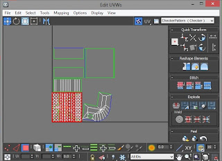
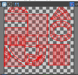
          This tutorial is all about the UVW wrapping texture technique. You can find the Unwrap UVW in Modifier List. Figure 1 shows the Edit UVW's window where you can detach the polygons/faces (not totally detaching it from the model but it is like making a copy of the polygons/faces you have selected) to add texture.

Figure 1. Edit UVW's window

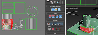
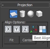
          Selecting the polygons/faces is easy compare to in choosing the right projection (Figure 3). According to the tutorial, we should try the different projection such as the Planar Map, Cylindrical Map, Spherical Map, Box Map and even the XYZ alignment options. So I followed him and tried it to get a proper shape. Unfortunately, some of my selections are not showing a good shape even if I play with the different options.

Figure 2. Cannot find the right form/shape
Figure 3. Projection

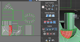
          So, I thought of making some parts of it. Such as from the selection in Figure 3 (red coloured polygons; right image), I divided the it into 3 (left, middle and right) selections. As shown in Figure 4, the pie look on the upper-left hand side image is the left selection, the box with white line in the middle is the middle selection while the red lines is the right selection. With this technique, I was able to lay them all the polygons properly.

Figure 4. Set by set selection

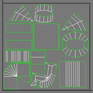
          When I rendered my UVW templates, some of the objects are missing. Why? Have you notice something in Figure 4, my objects are outside the box with checkered background. This is when I realised that I made a mistake already. To overcome this problem, I selected all the objects and scale them down to fit in the box with checkered background (Figure 5). After fixing the size and position, my template is ready (Figure 6) for rendering.

Figure 5. Scale down to fit in the box with checked background

Figure 6. Ready for render

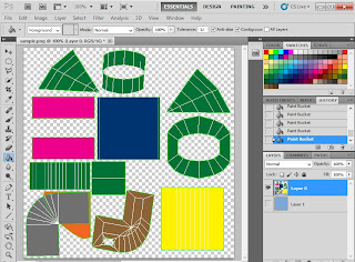
          I used Adobe Photoshop to add colours to the objects as shown in Figure 7.

Figure 7. Adding colours in Adobe Photoshop

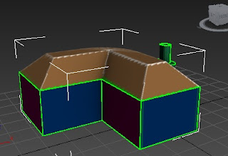
          Unfortunately, when I added the image to 3D max, it wasn't that good because the lines are visible. So next time, I should also include the lines in designing the polygons.

Figure 8. Final output

Friday, 2 November 2012

Model 1: Spaceship with more details

          Today, I decided to add a propeller into my engine so that it will look better (Figure 1). I saw this method from a classmate and tried it. It worked well and I am happy with the result. I can say that it add more attraction to my spaceship. I just made one of it then duplicate it with the Mirror tool. By applying the Align tool and Move tool, the propellers sitted in the right position.

Figure 1. Added propeller

Figure 2. Closer look to the propeller

Total Polys: 4, 542
Total Verts: 3, 912

          I also learned something today about the Layers and applied it into my work. Beside grouping the same elements, it is better to put them into layer like we are doing in Photoshop. Layers make the objects put into an invisible plane so that it will be easier to manipulate object and to speed up the rendering time.

Figure 2. Manage Layers

Thursday, 1 November 2012

Model 3: Space Tank Part 3 of 3

          This time, I added another object and I called this as the armour stand. At first, I made used of a single box and added new edges with QuickSlice then move some vertices. Unfortunately, I did not get the design that I want. If you take a look at my previous post where my base model is, the armour stand's edges (the top armour) are visible unlike what I made (it looks kinda flat in Realistic mode). So I decided to used Pyramid and manipulate the pyramid's vertices such us moving the vertices and Weld two or more vertices to somehow looks like my base model. Thus, the result is much better than the first method I used (Figure 1).

Figure 1. Armour stand

          One of the importing thing in making the tank is moving and aligning the objects. From the box to the Pyramid along side with another box and checking every angle if there are unwanted part. Figure 2 looks easy but I carefully move the vertices and the element even used X-ray mode to see if it is in the right position.

Figure 2. Aligning the elements
     
          My front big armour (Figure 3) is not as good as my base model but somehow I managed to make it look neat.

Figure 3. Front big armour
     
          I named Figure 4 as my rocket stand.  The technique I used here is the Reference option from the Mirror tool. So that if ever I will do some modification, the other one will automatically modified. Therefore, it will save time. However, I used the Copy option in the middle element. The reason behind this is that, when I first duplicate the image by Reference then deleted some polygons from it, I realised that the other element's polygons are gone too. Good thing there is undo option and I was able to redo the step but with different approached.

Figure 4. Rocket stand

         Because I always accidentally moved the tank's body, the alignment between the body A and body B (from my previous post, I duplicate the half of the body) is a disaster. To end this problem, I attached both of them and combine the vertices (Figure 5) so that it will become as one element.

Figure 5.  Attach and Weld

          In making the rockets (Figure 6), I just made one then duplicated it. The red circle in the middle of the rocket, I did not add another element but made used of the polygon of the cylinder. I detached the polygon, changed the colour and then attached it back to the cylinder. Moreover, I did not extend the box up to the front rather I aligned it from edge inside the rocket box. This is because it covered the rockets. I did try using the Boolean but I failed. But if I'm going to do the same step, I thought of using the slice then make a rectangle and use Boolean option. Another method would be after slicing,  delete the unwanted polygon then just create polygons to cover the hole.

Figure 6. Rockets


          Figure 7 shows some details I added to the rocket holder. I felt like I should put something on that place because the cylinder holder is too small for the rocket box. If this is true, the rocket box might collapse because it is too heavy with loads of rockets inside and nothing supports it.

Figure 7. Added details on the rocket holder

          I created so many elements. By grouping them as shown in Figure 8, it will be much easier to locate each elements and it looks neat and in order.

Figure 8. Grouping

          After so many hours I spent in doing this and errors encountered, I finally finished my space tank as seen in Figure 9.

Figure 9. Space tank in Realistic view

Figure 10. Space tank in Wireframe view

Total Polys: 14, 933
Total Verts: 10, 314

          There is a huge amount of polygons in this model, it is because of the details I put and some of the errors I made. For those people who are making models for gaming, it is better for the model to have a small amount of polygons so that it will be rendered easily and not too heavy for the program. But for us, Media and Internet students, this is okay.

Model 3: Space Tank Part 2 of 3

          For my front design, I used box to make it. As you can see (Figure 1), I added more height to my box. This is because I wan to cover the flaws of the tank. When I put this object with Autogrid, it was not placed properly, maybe because the body of the tank was not flat. So I rotate and move the object.

Figure 1. Front design


Figure 2. Side design

          The side design took me a long time to make it. It is because of the angle of that part so I did a lot of rotating and moving the object. As shown in Figure 2, I added a rectangular shape object and made it into X-ray mode so that I could see the shape of the tank's body. With this method, it is easier for me to add edges using QuickSlice patterned to the body of the tank. I added more details on this design by slicing and extruding it (Figure 3).

Figure 3. Add details and Extrude polygon

           Unfortunately, there was a problem with this method. As you can see in Figure 3, the lower part of the side design is so messy. It is the outcome of extruding the polygon. In addition to that, there are gaps between polygons. To overcome this problem, I decided to move the vertices and cover the gap and I even deleted unwated polygons (Figure 4).

Figure 4. Moving the vertex to cover the gap

          I just realised that it would be much easier to delete the side polygons and then create new polygons using the Create option. This method might give me a neat outcome compared to what I have done. Anyway, I did not do it because of the effort I put when doing the messy method.